Concept Design
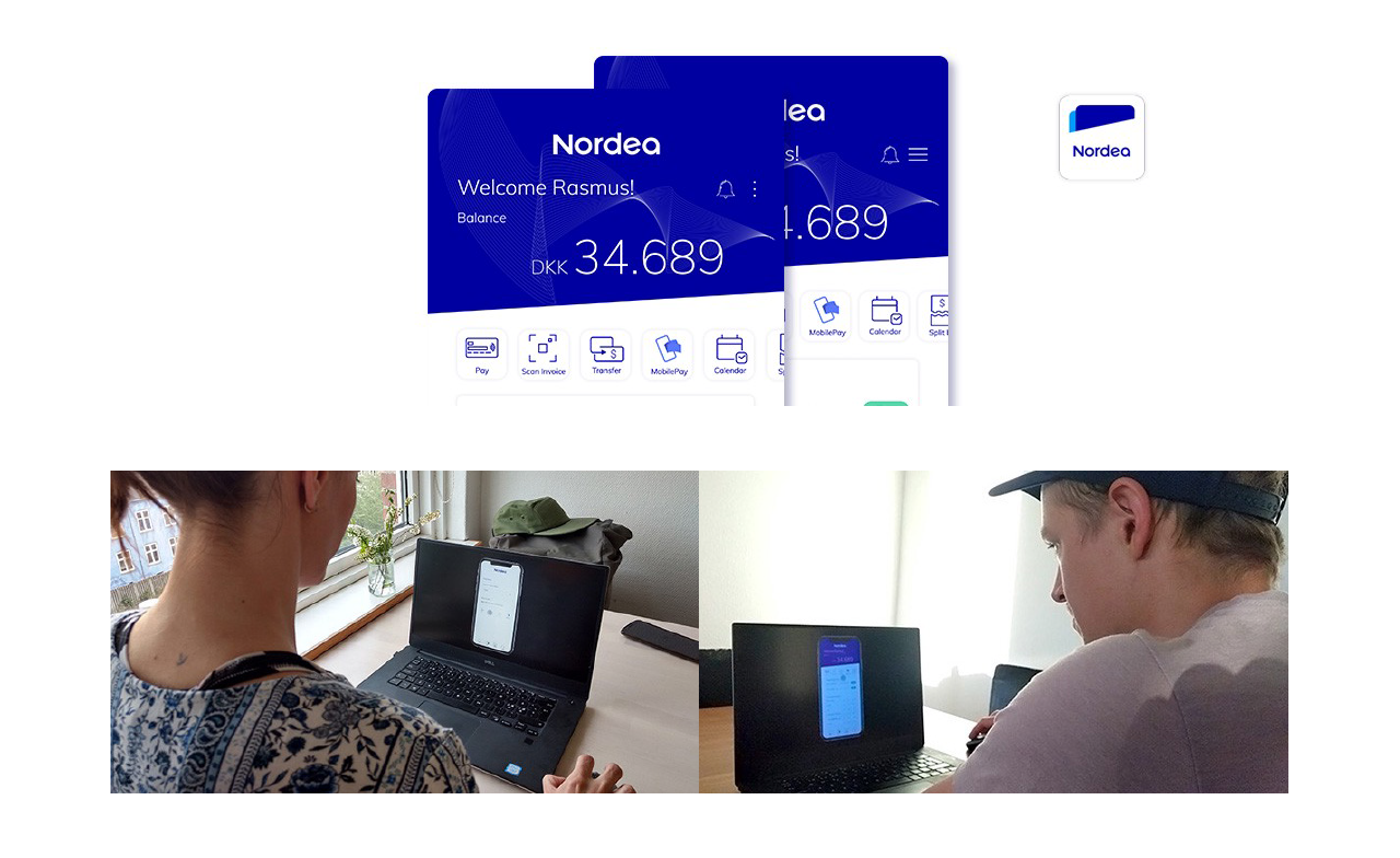
Nordea App
Banks always drew my attention. After all, it is where our money goes, where a lot of people of different demographic characteristics join. And where any error is critical, because we are talking about people’s money. So I came up with the idea to redesign the app, or at least a little part of it, to show my skills, but also, to start getting into the mindset of app bank development business.
Research: I don’t know anything about banks
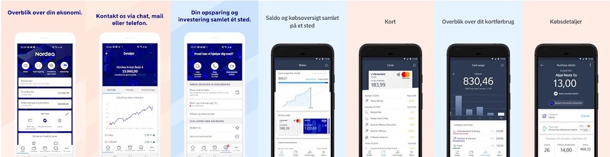
Keeping this on my mind, I started with some research. I made a benchmark of other bank apps because they have the Know-How. Also, I read forums to understand what was user complains or appreciations. I was trying to explore how people interact with banks and what is the mindset. What do people think about banks? How they might be a closer relationship? Taking into consideration functionality as well as engagement.
Defining: Targeting the users
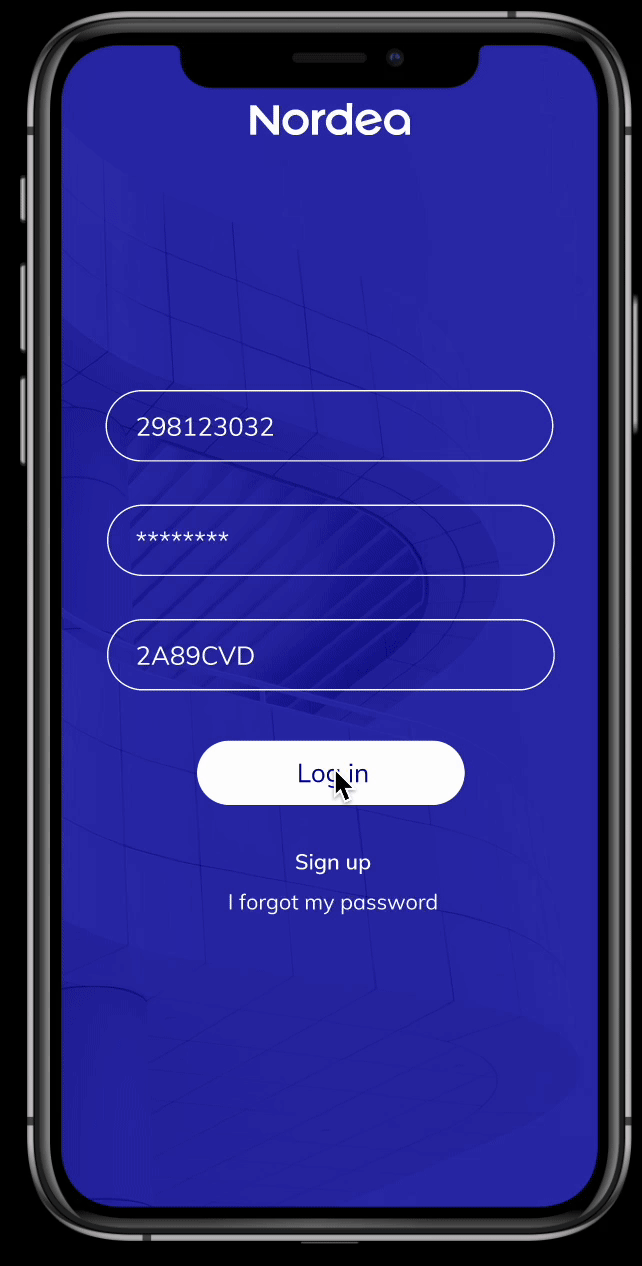
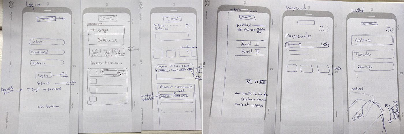
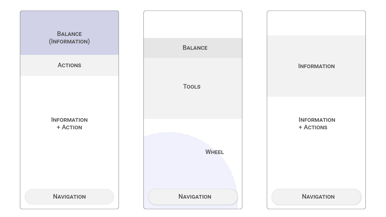
A good look and feel were important, to make the app techy, fintech, and more; but also, there are a lot of people with no tech-skills that need to understand and use the app. This bank has a wide target of ages and different kind of people. The electric blue of the brand and clear icons, with the function written below, can help with that. Also, a toolbar, just below the balance where I can reach what I want to do really quickly, it is handy and is more or less in the middle or next above the middle of the screen. Also, a tab bar with the main sections and a menu where is the user’s profile can be edited. It is important to guide the user through the app, naming every icon. An easy flow in user tasks allows people with poor tech-skills, use the product efficiently.
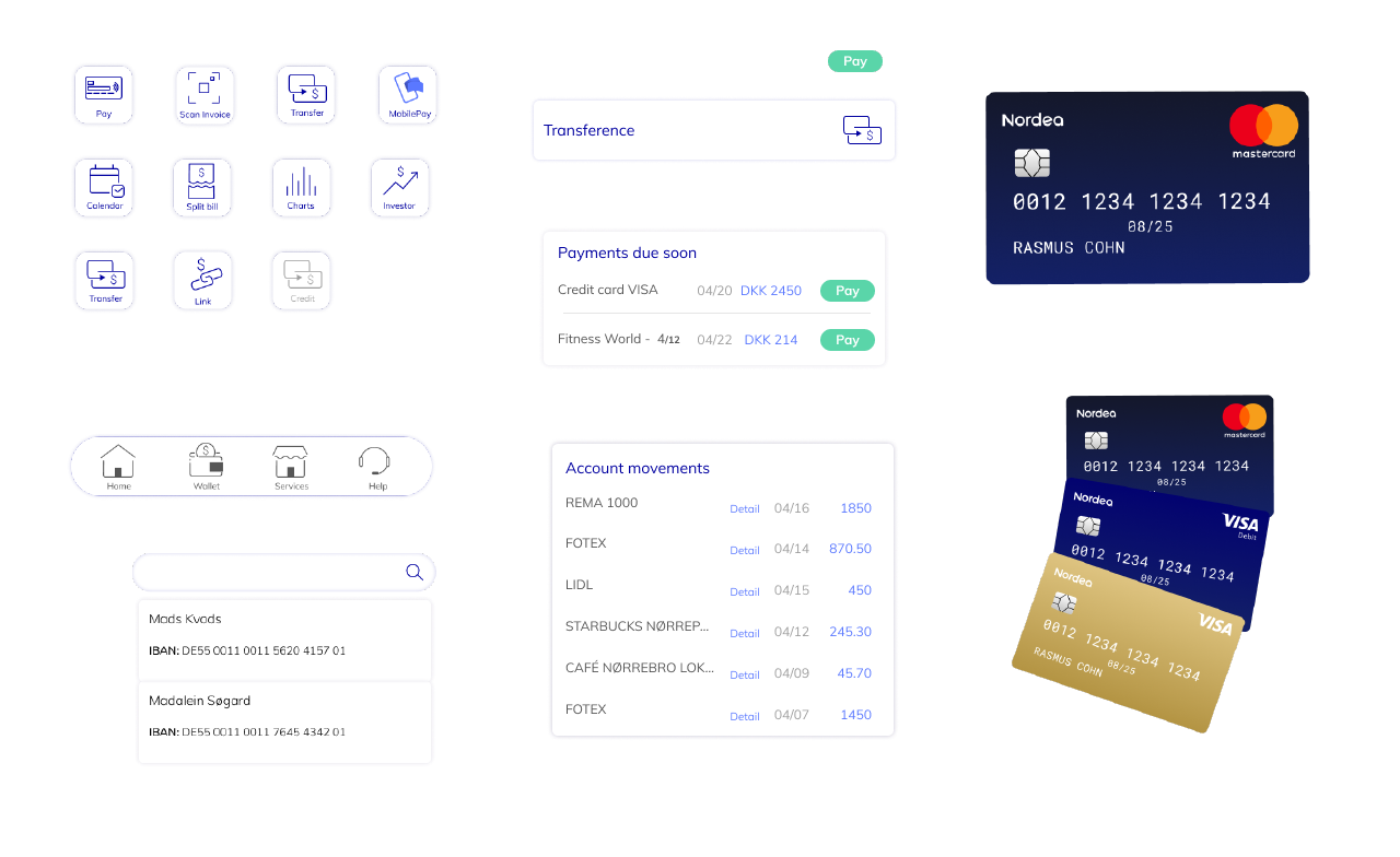
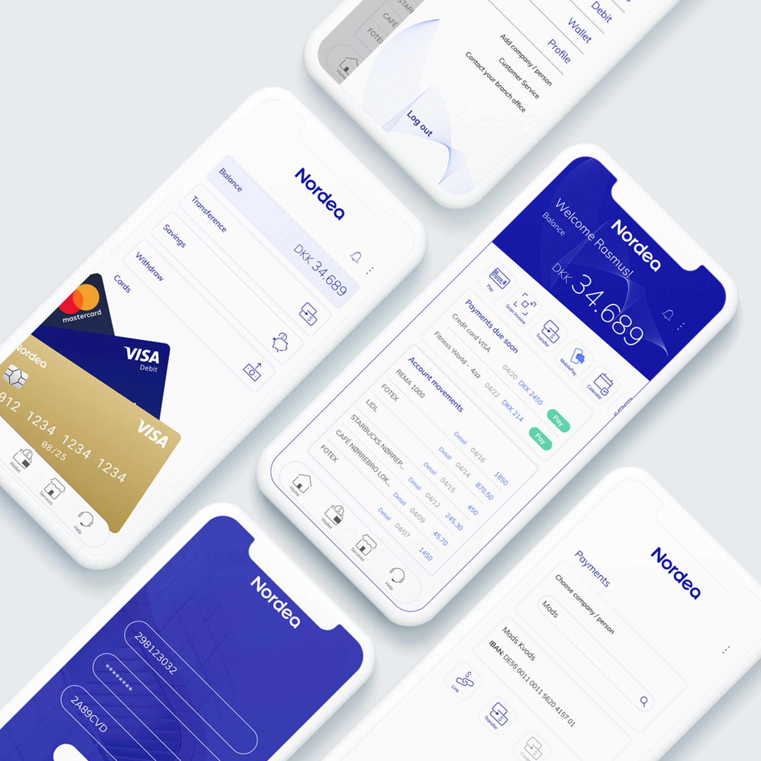
The value proposal: What I found when I open my wallet?
So, at first view, you can control your balance, your bank account number, different tasks, account
movements and check dates of payments due soon.
The main idea behind the layout would be layers that alternate information and actions through the whole
structure using it as a guide.
The user should be able to reach people to pay or transfer money with the predictive search bar. And if
you want to see your Wallet, you have some of the tasks you already have in the Home, but...
What kind
of
things can I see in my wallet?
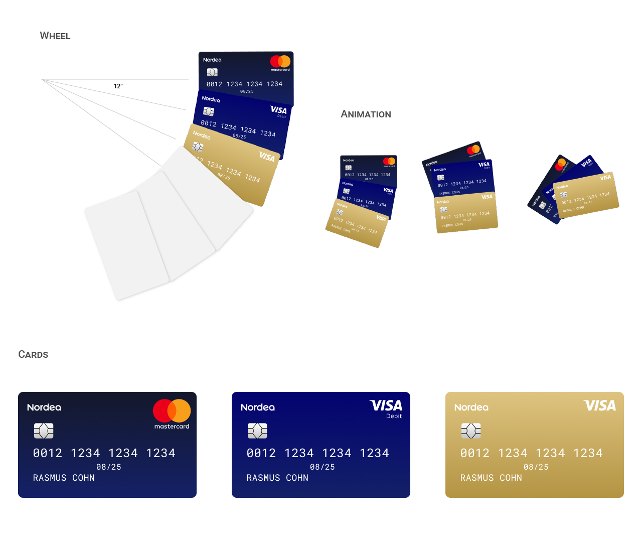
The visual user interface
The idea of have all at one glance challenge the minimal design but at the same time meaningful. I decided to keep the interface as clean as possible, with vibrant colors for CTA and cards that wrap pieces of information.
The user can check the balance, savings, transferences, withdraws and the most visual feature there, cards. Users pays with cards (debit, credit). A draggable wheel of cards, that I can select and pay, using NFC technology could make the look and feel realistic. Like holding a card in the hand.