Juno branding presence
For Juno Drinks, one of the challenges was visibility. While their kombucha is usually sold in cans with a strong visual identity, in some restaurants the product is served in bottles and poured directly into a glass. In that context, the brand almost disappears at the table: the customer enjoys the drink, but may never see the logo, the flavors, or even know where it comes from.
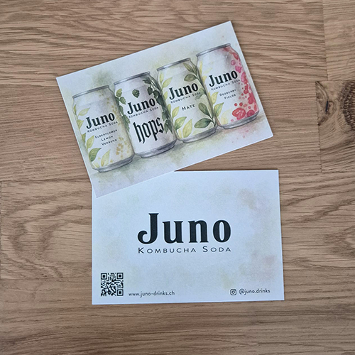
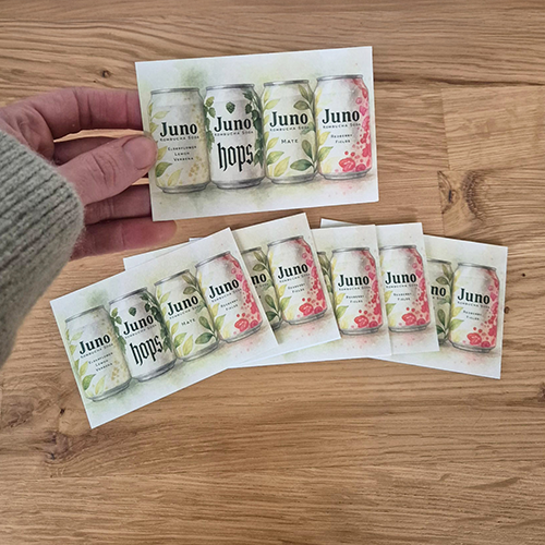
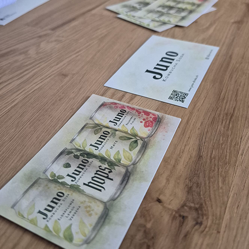
To solve this, I proposed a simple, physical touchpoint: small printed cards brought to the table together with the kombucha. These cards reintroduce Juno’s branding at the exact moment of consumption, showing the brand, the available flavors, and the broader range of solutions Juno offers. The design is intentionally compact and unobtrusive, fitting naturally into the restaurant experience while still being visually clear and recognizable.
As an extra layer, the cards include a QR code linking directly to Juno Drinks’ website, allowing customers to explore more, learn about the brand, and even order kombucha themselves if they enjoyed it. It’s a small intervention, but one that turns an otherwise anonymous glass of kombucha into a branded experience, strengthening awareness and creating a direct bridge between the restaurant and the customer.