Problem
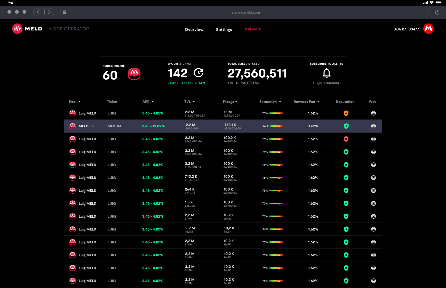
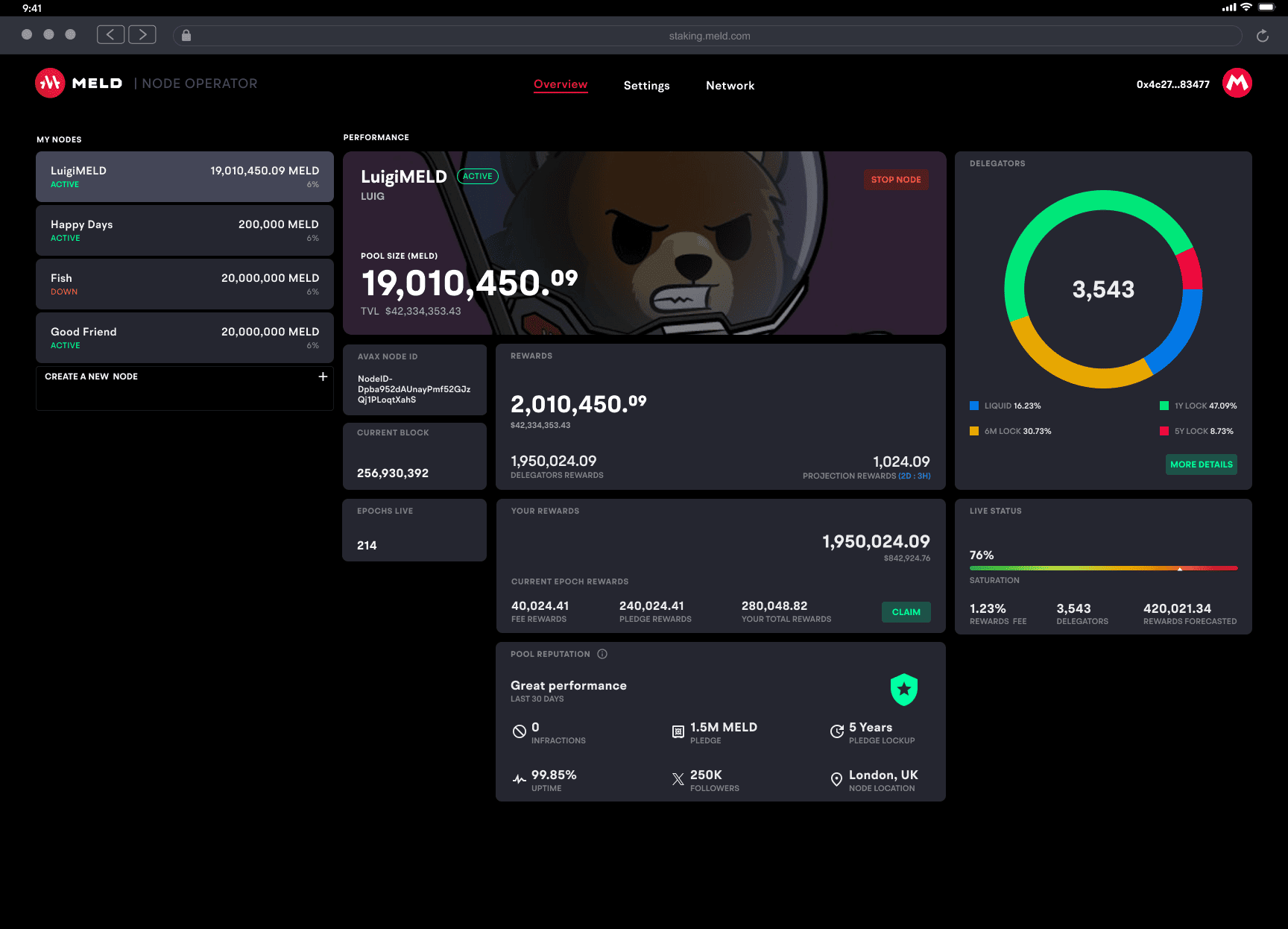
In a staking ecosystem, different groups rely on the same network data but expect different experiences. Delegators (users who choose where to stake) need to compare pools and decide whom to trust. Node operators (pool owners) need a control center to manage performance, identity, and rewards. Governance (people monitoring rules and behavior) needs visibility to detect irregular activity and act when needed.
Business wanted to open this feature to many node operators, but the system was not ready for scale: there was no clear governance model, no clear operator tooling to manage pools, and no scalable way to keep pool visuals consistent.
Even though the public layer is what most users see, problems in deeper layers affect trust at the surface. Missing or inconsistent pool images can make legitimate pools look suspicious — especially in crypto, where scams exist. If a platform appears to host “unsafe-looking” pools, it can harm brand trust.
Desired outcome
The goal was a cohesive platform where all layers work together in a transparent and trustworthy way. Delegators should compare pools with confidence, node operators (pool owners) should manage their presence in one place, and governance (people monitoring rules and behavior) should detect issues early and communicate actions clearly.
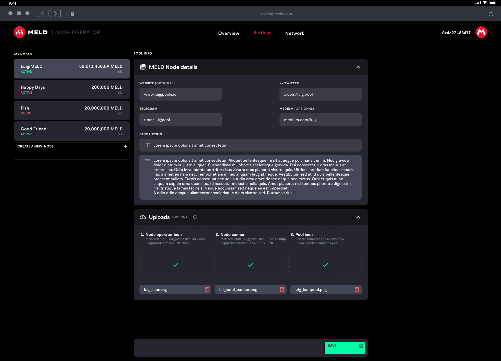
The ecosystem also needed a scalable way to keep pool icons and token visuals consistent as the number of assets grows — without turning design into a permanent bottleneck.
The plan & design
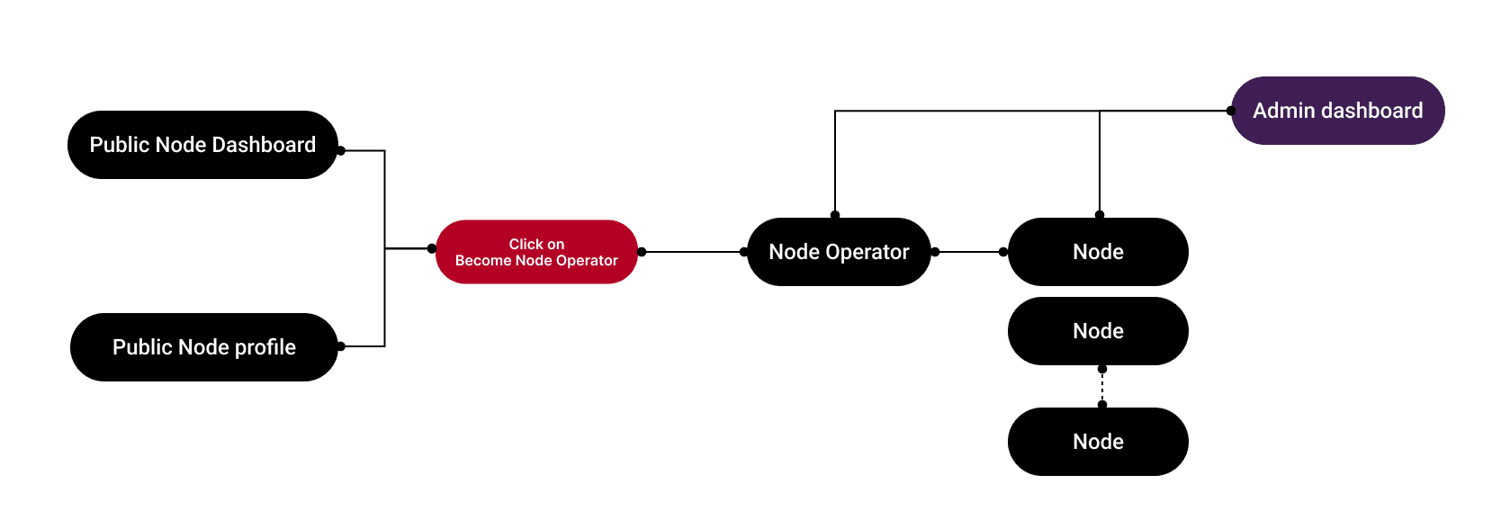
I designed the experience as a multi-layer system: public discovery for delegators (users who choose where to stake), operational tooling for node operators (pool owners), governance oversight (people monitoring rules and behavior), and a visual layer that keeps identities accurate (icons, banners, token assets).

I defined flows and information architecture to connect the layers, so the mental model stays consistent and decisions feel clear across roles.

For governance, I spoke with the CTO to clarify what “warning”, “slashing” (a penalty), or “suspension” should mean, and what criteria should trigger each state. This ensured the interface could reflect real rules, not guesswork.
For visuals, the first request was to produce pool icons manually. But with growth, that approach would not scale. At that stage, I reframed the discussion around long-term ownership. A manual solution would centralize responsibility and create future friction. The architecture needed to distribute autonomy instead.
I designed templates and constraints so node operators (pool owners) could upload and manage their own pool visuals in a consistent way. To align incentives, pools that followed the standards could appear higher in the public list, giving operators a clear benefit for doing the work properly.

Templates + constraints reduced noise, improved trust, and made visual identity management scalable.
Outcome
The final system improved clarity and trust across the staking experience. Delegators (users who choose where to stake) could compare pools with more reliable signals, node operators (pool owners) gained a focused control center, and governance (people monitoring rules and behavior) improved transparency and early detection of issues.
The visual layer turned an unscalable manual process into a structured pipeline. This reduced dependency on a single designer, supported ecosystem growth, and protected consistency as the number of pools increased.