MELD (Fintech)
Product design · MELD · 2022 → 2024MELD started as a non-custodial crypto wallet and grew into a broader financial product, with the ambition of making on-chain and traditional finance feel like one system. I was the product designer across its three surfaces, web, native mobile and browser extension, built in parallel rather than in sequence. I also maintained the design system and mentored two junior designers.
Security that no longer blocks entry
Activation was low. People started creating a wallet and never finished, and the reason was structural. The single most demanding task in the whole experience, the 24 word seed phrase and its verification, came first, before the user had seen anything the product could do.
Copying 24 words to paper and validating them back is genuinely heavy, and we were asking for it at the exact moment the user had the least reason to care.
The question was when, not whether
The seed phrase is a non-negotiable standard in blockchain, so I could not remove it. But I could move it. I redesigned wallet creation so the seed phrase no longer stood between the user and the product.
Creation offered a clear two-path decision: go straight to your wallet, or secure it now. Skipping was not frictionless, it triggered a confirmation that made the user acknowledge what they were skipping. Even the skip was designed to be deliberate.
Before, four steps to entry, with the heaviest one up front. After, three steps and a fork. Switch between them.
Security had to stay inevitable
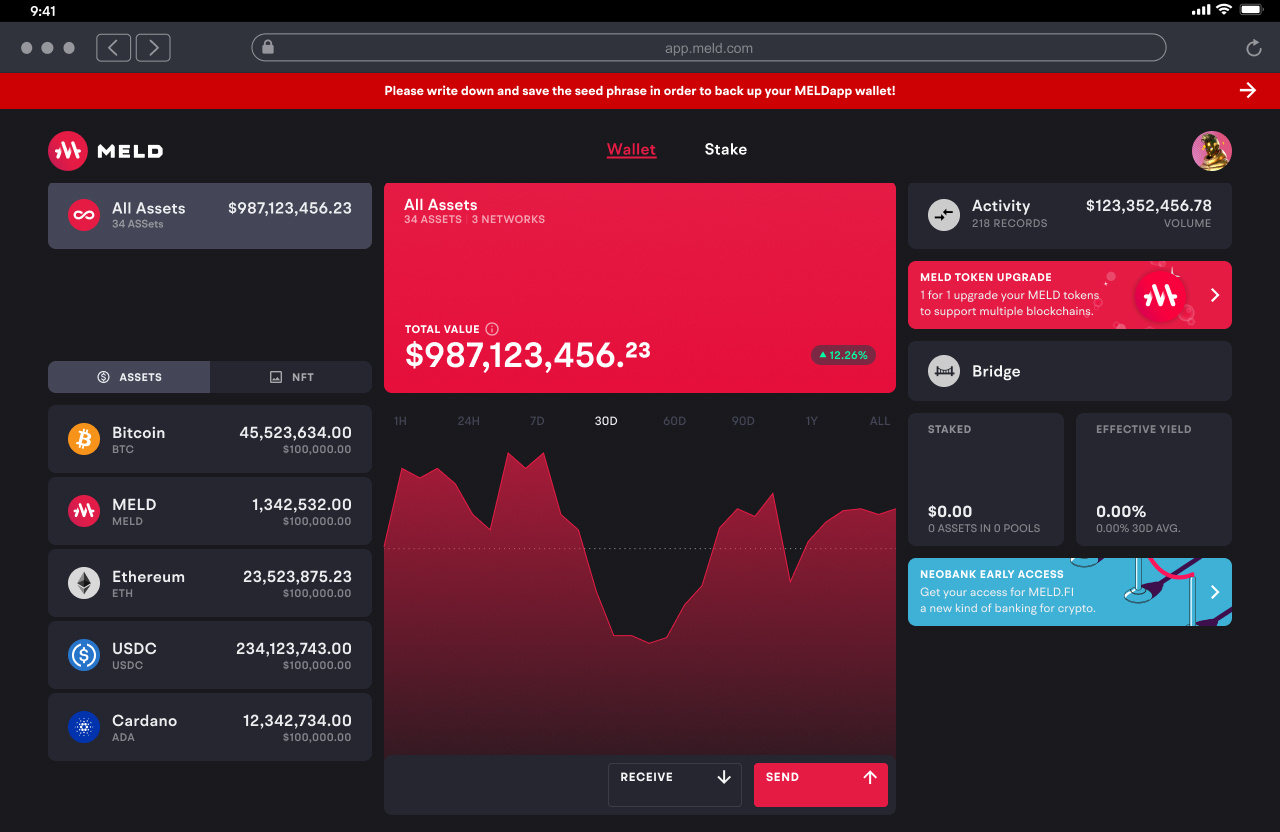
Letting people in unsecured is a real risk and I did not want to hide it. The unsecured state was made impossible to ignore: a persistent banner sat across the top of the wallet asking the user to save their seed phrase, and it could not be dismissed. The only way to clear it was to actually complete the procedure.
That is the whole idea in one move. Entry was easy, security was unavoidable. The friction was not removed, it was relocated to a place where it no longer blocked discovery but never stopped applying pressure.
These are the results we could infer from the analytics available at the time, and the impact was large.
One language for managing money
Fiat and crypto may look similar at product level, but underneath they follow very different rules. Bank transfers, token transfers, swaps and exchanges each introduce different networks, recipients, fees, timing and validation.
The principle: users should not have to relearn the product every time the underlying rail changes. Keep the interaction predictable and expose complexity only when it materially changes what the user needs to know or decide.
From product vision to product rule
As MELD expanded this became more than a screen pattern. It became a way to evaluate new product decisions. When a new asset, transaction type or technical constraint appeared, the starting question was not how to create another flow. It was what was genuinely different, what could remain familiar, and how much complexity the product could absorb before passing it to the user.
That turned a company level ambition into a principle I could use to push for consistency as the system grew.
Four different rails, one structure. The assets, fees, networks and execution rules change. The mental model stays intact.
The pattern had to survive beyond exchange. Sending crypto and withdrawing fiat rely on completely different infrastructure, yet both follow the same progression: define the amount, identify the destination, review, confirm.
One product, three surfaces
Web, native mobile and a browser extension, built in parallel. The same jobs appear on all three: create and secure an account, hold assets, move money, understand a transaction. What changes is how much room there is to do them.
None of the three is a resized version of another. Each one re-expresses the same model under its own constraints, which is the real test of whether the model was any good.
Three columns, one contract
The web application started with core wallet functionality and kept absorbing heavier features: staking, then supply and borrow, where users post tokens as collateral to request loans. Each one brings more data, more risk and more to explain.
The answer was a fixed spatial contract. Three uneven columns: assets overview left, the main card centre, context and actions right. Selecting an asset updates the centre and the right together. Starting an action slides a drawer in from the right, which blocks other interactions until it resolves. Same behaviour everywhere, so a new feature never means a new set of rules.
The same spatial contract across every section of the web product.
Research, and what Web3 takes away
Comparing MetaMask, Nami and Phantom showed each wallet is built around specific blockchains and their native tokens. For seasoned users, swapping within and across chains is routine. For newcomers coming from fiat, it is intimidating. The product had to stay approachable without being useless to experts.
User management in Web3 is also fundamentally different. There are no rich user profiles, only wallet addresses, which strips away most of the data a consumer product would normally design with. Given how much information crypto throws at a screen, organising it without overloading the user was the central interface problem.
Mobile augments the web experience
Mobile was built as a native application on purpose, not as a responsive adaptation, so the three column logic could not be replicated. The architecture moved from spatial simultaneity to sequential interaction: the central logic of the web merged into a card based structure where each asset became a focused view.
Asset cards originally relied only on swipe to navigate. Beta feedback showed that was slow once the list grew, so the pattern was refined into press and hold plus swipe: holding the current card reveals a horizontal strip of asset icons for fast switching, without a permanent side panel. That replaced the left column of the web while preserving the same asset first mental model.
The screen is not the limit
Managing money on a phone in public is a real exposure: a bus, a café, someone over your shoulder. I treated it as a requirement, not an edge case, and used a quick phone flip to hide every sensitive value at once. The gesture was not new. Deciding the product needed it was the call.
I also removed a redundant PIN that sat on top of the password. It cut friction, lowered the risk of forgotten credentials, and prevented backend redundancy with duplicated profiles tied to the same wallet.
The smallest surface
The browser extension is the hardest test of the system. The same non-custodial wallet, the same jobs, in the least space the product ever had, next to a job the other two do not have: connecting to decentralised apps.
Nothing new was invented here, which is the point. Onboarding, assets, send, receive, security state and transaction detail all carry over. If the model only worked at desktop width it would have broken here.


Gamification workshop
The workshop was about defining the mechanic itself, not decorating the product with one. We worked around Octalysis as a reference rather than applying it literally, and ran the session against the business goals of the period, so each proposal had to say which goal it served and what story it told the user.
Every participant got a fixed amount of money to allocate across the ideas on the table. A finite budget forces a ranking: you cannot fund everything, and defending where your money went surfaces why a mechanic actually matters. The ideas that survived were put to a vote, and what came out was a set of named badges tied to concrete benefits rather than a running points counter.
Underneath the badges we proposed a logarithmic progression of performance instead of linear points. On a linear scale the heaviest users saturate the ladder almost immediately and the scale has to be extended every time somebody outgrows it. A logarithmic curve spends its resolution where behaviour actually changes: the first actions move the needle a lot, and each later tier asks for roughly double the cumulative activity of the one before, so the ladder never runs out and never becomes trivial.
The curve sets the pacing. Direction came from what fed it, since the actions counted were weighted by the business goals they served, so climbing meant doing more of what the product needed. The badges mattered for the same reason: once the marginal value of each action shrinks, a discrete benefit at a threshold is what keeps the strongest users moving. It reached proposal stage and the company closed before it shipped.

The system underneath
A compact kit of cards, accordions, buttons, drawers and inputs covers every surface in the product. Reusable primitives kept Wallet, Stake and Supply and Borrow consistent as new features shipped, and a disciplined palette signals asset state, risk and action tier without competing with the data on screen.
Hierarchy is carried by typography, size and weight rather than colour, precisely because colour was already doing semantic work.
Wireframes as a shared instrument
Wireframes were not a deliverable, they were how the team talked. In daily design meetings we walked flows together, identified pain points and set validation checkpoints inside them, which caught errors before high fidelity and produced a map everyone agreed on.
This project also confirmed that wireframes are guides rather than final solutions. Design is not a refined wireframe, it is a problem solving process where UX and UI converge and the solution often appears during the act of designing.

Colour as a semantic layer, not decoration 
The component kit behind every surface 
Wireframe analysis from the daily sessions 
Staking returns an NFT receipt that doubles as the main card
Extras
Two and a half years of product work does not fit into five stories. These are the pieces that carried real weight without becoming a chapter of their own.
- Streamlined the KYC flow alongside wallet creation.
- Standardised swap, exchange and transaction patterns across crypto and fiat.
- Defined clear and consistent asset nomenclature across the product.
- Standardised transaction receipts and a shared transaction detail model, so different asset types and outcomes read through one structure.
- Designed the promotional surfaces for premium benefits.
- Defined a mobile specific visual style, detached from the web app while staying aligned with the brand.
- Maintained the design system across three surfaces and two build environments.
- Mentored two junior designers.
- Analysed blockchain flows end to end, from input to output, identifying error checkpoints and keeping them legible to developers.
- Oversaw branding and web side projects, including the bridge and the node operator platform.
Where it ended
The native mobile application was completed and released to early beta users before the company closed. Feedback was positive and fed directly back into the interaction work, which is where the press and hold refinement came from.
The lesson I carry is that security and friction are not the same thing, even when a product treats them as if they were. The seed phrase had to exist. Where it sat in the experience was a design choice, not a security requirement, and most of the activation problem lived in that gap between what genuinely had to be protected and what we had simply assumed had to come first.